First of all, I feel compelled to apologize for the photos. Looking back through old pictures, it looks like it took me a solid year to figure out how to take pictures in the last house, and even then it was often a struggle. I’m totally starting from scratch here. I have no idea how to take pictures of most of these rooms without making them look like caves.
Anyhoo, ready for the poorly lit tour?
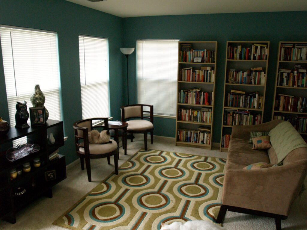
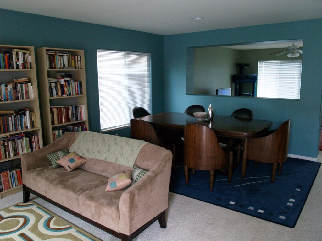

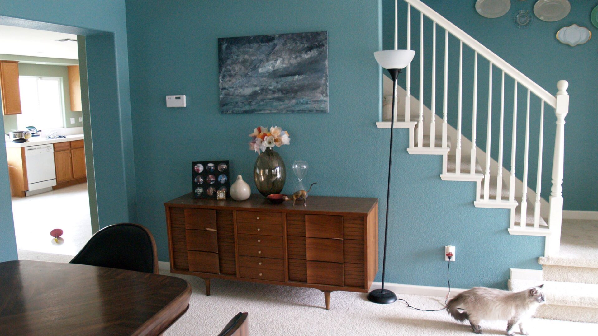
Here’s a pieced together view of the front room. It’s quite big, big enough for my little library room and a dining room with my enormous table, but I realize now that I have been forever spoiled by the super tall ceilings in the last house. Not having them has made painting a breeze, but the house feels so much smaller to me. Despite the fact that, thanks to the housing boom and then bust, we have some slightly embarrassing square footage at our disposal.
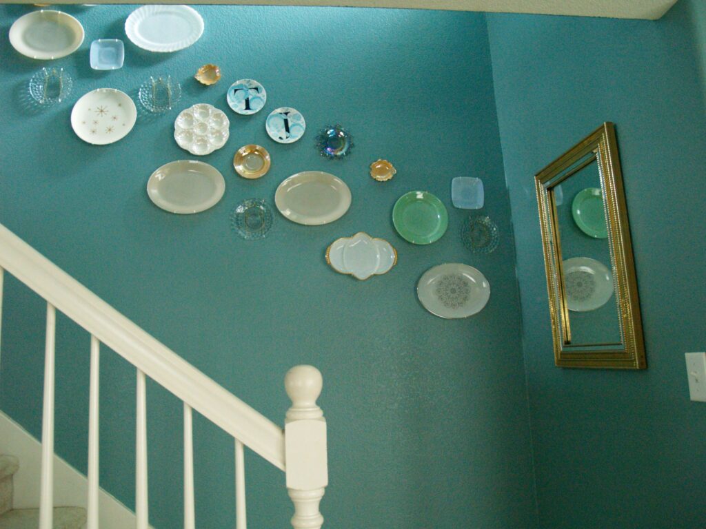
I debated and debated whether I should put the plate wall back along the staircase or put it somewhere more prominent. It was such a focal point of the last house and I always got so many compliments on it, it was hard to relegate it to a place where you could only see a part of it. But that is a whole lot of wall space to leave empty, so…I don’t know. One thing I do not regret is giving that mirror a more central location. That was one of my very first Craigslist scores, and I’m happy that it has a place of prominence here.
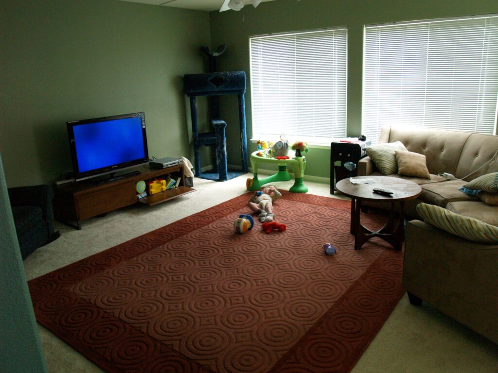
The family room is so big that I feel a sudden compulsion to buy all new furniture. I’ll be keeping my eye out for a bargain couch, but I usually hate entertainment centers and was so happy with this little low profile one. Maybe I can come up with some wonderful thing to put on the wall that will make it fit in better.
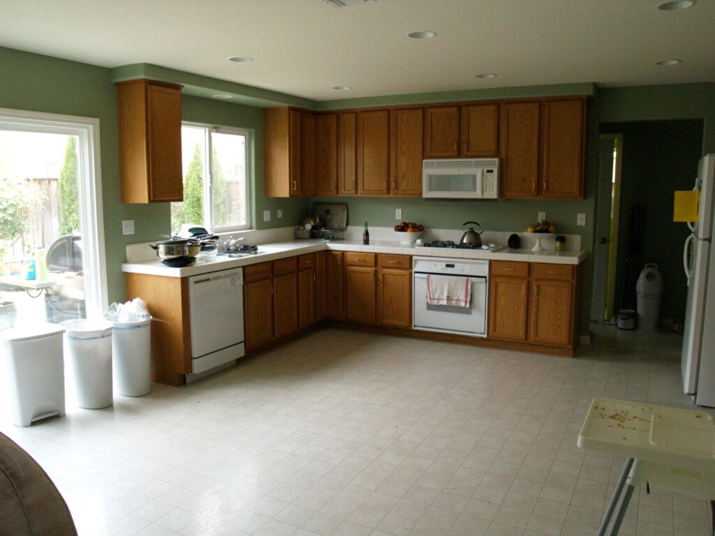
And the ridiculously big kitchen. The kitchen that is really too big to not have an island. I love the way the green looks with these cabinets, but I’m going to have to do something in this big fat space. I don’t think a big kitchen cart would be too hard to build. Luckily I have a local friend who’s a woodworker, so I’m going to put him to work. And then when we move to a different house where I don’t need a freestanding island, it can go outside and be the place I will one day successful germinate a seed.
Now for the upstairs…
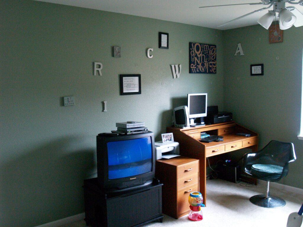
Right at the top of the stairs is this loft room, and we’ve put our ancient TV here so that Atti can jump in his bouncer and watch Sesame Street while I type on the internet. The great thing about this space is that it essentially functions as Atti’s playroom. We can put most of the big play stuff up here, away from the adult spaces, and there are tons of closets upstairs to stash his toys. Our last house was starting to get seriously overwhelmed with all his equipment.
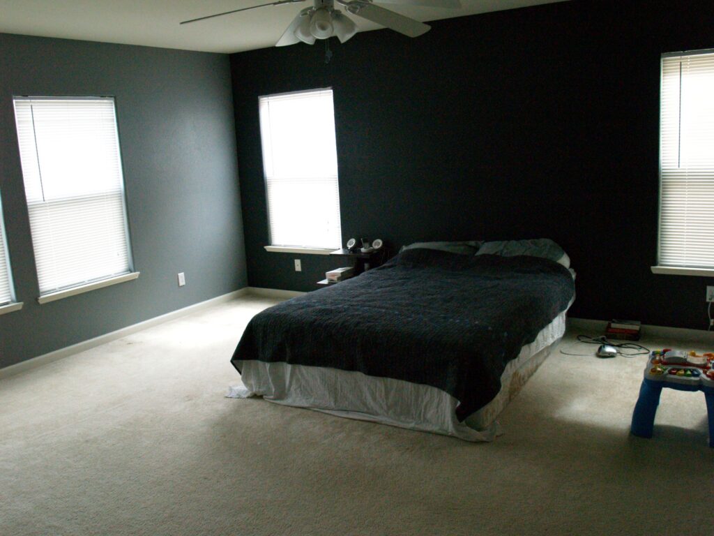
The cave-iest of the cave pictures, I actually love how our bedroom turned out. In our last house I chickened out on the paint colors and ended up with lavender walls with a brown accent wall. It was fine, but not at all what I was going for. This is what I was going for. Gray walls with a charcoal, almost black, accent wall.
Someday we’ll replace this ancient queen bed with a king (three cats, two tall people and a growing toddler had us finally seeing the need) and when that happens I’ll build us a headboard, get this bed off the floor and finally live like grownups.
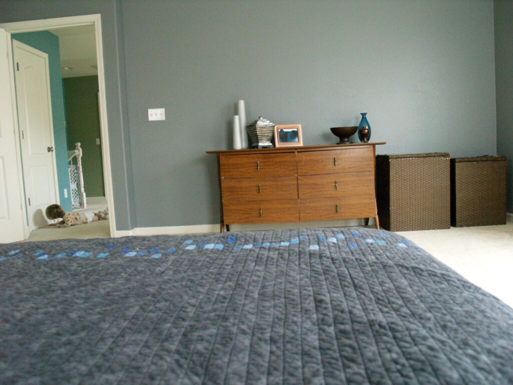
We moved that great dresser I put in my studio last time into the bedroom, and now Bear and I each have our own dressers. It’s a luxury unlike anything I’ve experienced in my married life.
But still, with two dressers, a queen bed, a small jewelry cabinet and an endtable, we are nowhere close to filling up this room. And we never will. Honestly, sometimes I just don’t know what builders are thinking when they design these houses. What else do you need in a bedroom? Why put all the square footage here?
This house is way bigger than our last one, which is sometimes good (like the loft) and sometimes bad. During the housing boom there were several building companies creating these new developments, and they almost got competitive over who could build the bigger house. There is a lot of wasted space just to make things bigger. I’d love to have the master be half the size and have another usable bedroom. Or make the overall house a little smaller on the lot so that my neighbor and I don’t have to fight over where we put our trash cans. Truth be told, if a smaller option was available when we were looking I probably would have taken it. But overall, it’s a great house and we got so lucky to find it when we needed it.


i love it! great job – and the change the paint makes is sooooooooo nice. have you told the owners yet? how'd they take it?
Looks great! I really love the grey and charcoal in the master bedroom. And yes, I'm curious about the owners' reaction to the paint job, which looks amazing, btw. So much space! We moved from our house to a small apartment and I'm relishing in the lack of space. Keeps the clutter down :). Makes not being able to paint almost worth it.
I love how you recreated the same feel of the living room in your old place. The blue walls combined with the plates and the furniture works great.
Yeah that is really an art work by him. I liked the work by him. Thanks
So far the painting is our little secret. We want to go as long as possible avoiding that confrontation. But seriously, we did the owner the BIGGEST favor. Not only were they painted awful colors (whether she picked them or not) but they were filthy and riddled with holes. She may disagree, but we only added value with all this work.
It looks great…and I'm here shaking my head wondering how you got your house to look so amazing (yes..I know…hard work!LOL) when I've been in mine longer than a year and still don't have much on the walls…maybe this will put some fire under me! I really like the bedroom's wall colors. This year, for the first time ever, I got a separate dresser for my husband and yes…I LOVE having my own!LOL!Great job!
Very nice, your hard work shows. I have always loved that plate wall, so beautiful. I'm sure Craig's List will help fill up all your new-found space! Relax and enjoy!
BRAVO!!!! Claps ludly.. and well done on not only all th3e painting but getting things up on walls too. I took over a year to pull that one off, so pleased to see things like your plate wall and the letter wall. Don't worry about the extra sofa in the family room, Atti like most kids will need ALL that floor space for various games, toys etc… regardless of plans to put them upstairs.
I love love love your living room. I also can't believe how fast you got your whole house put together!
Hi Reese, been following your blog for about a year, not sure if I've commented before. I just 'discovered' Ana White over at http://www.knockoffwood.com at Christmas this year and… am in love with the blog. She has some great kitchen island ideas and her blog readers have some amazing things to share too! Neala
Terrific decorating!! The plate wall with the mirror at the bend looks great, the living room really doesn't need an extra sofa if you can't find a suitable one and that big bedroom was ideal for that colour scheme as I'm not sure a smaller room would have handled those colours. The kitchen cart sounds like a great idea and you can wheel it outside to use when you have barbecues. Well done :).
How many machines for woodworking your friend have? I want to know about some table saw machines. Help me out here.
What kind of help you need Abelsen? May be i can help you about the table saw or any woodworking machine.
great
Information the primary bona fide instrument which will keep upgrading those all the time and yes it visits to your next name within lifestyle. Learning enables individuals work better and can create open doors as to possible and moreover rational financial propel now and furthermore time.